
Challenge
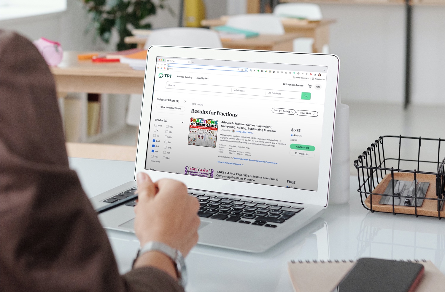
For busy teachers with limited time, TPT's resource search was getting in the way.
Usability issues made it slow and frustrating to find the right resources.
Senior Product Designer · Research, UX audit and redesign
Process
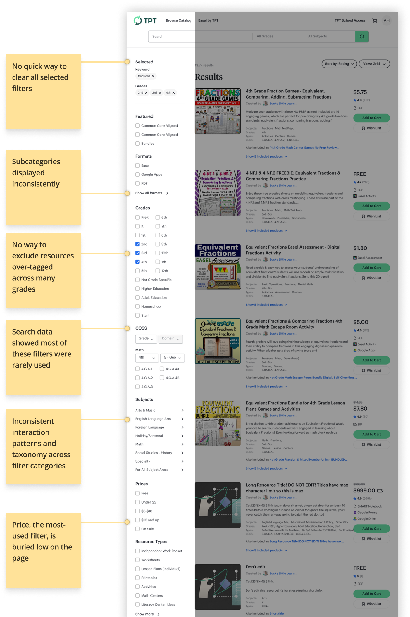
To understand where the experience was breaking down, I paired qualitative research on users' goals and pain points with an independent UX audit.
Together they revealed six key issues, from filters that couldn't be cleared at once to Price, the most-used filter, buried low on the page.
 Browse CatalogEasel by TPTTPT School Access
AH
fractionsAll GradesAll Subjects
Solution
I redesigned the filter panel to resolve each issue the research surfaced.
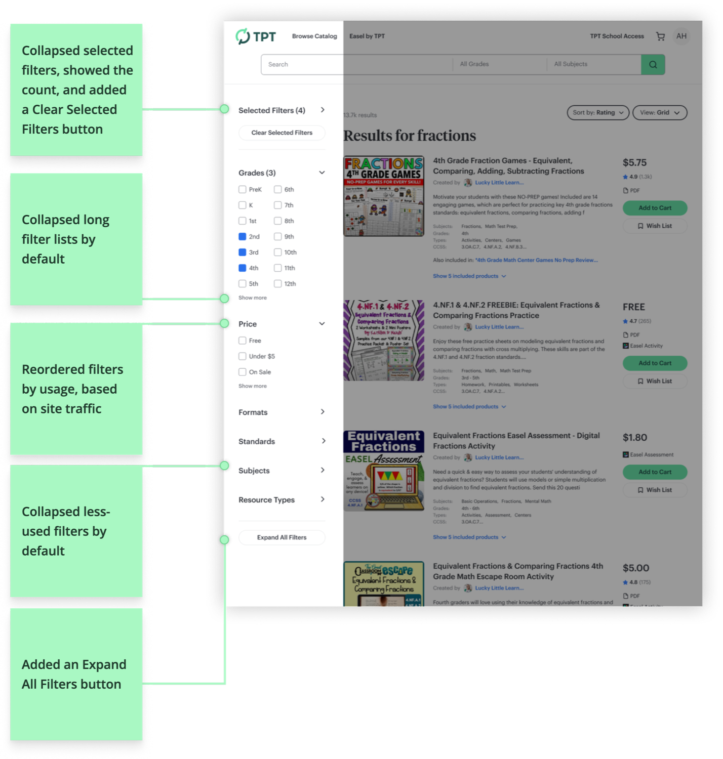
Baymard Institute's search and filtering research guided several key decisions, including collapsible sections for less-used categories, a unified subcategory structure and global clear-all and expand-all controls.
Outcome
The redesigned filter panel shipped across TPT's search.