Challenge
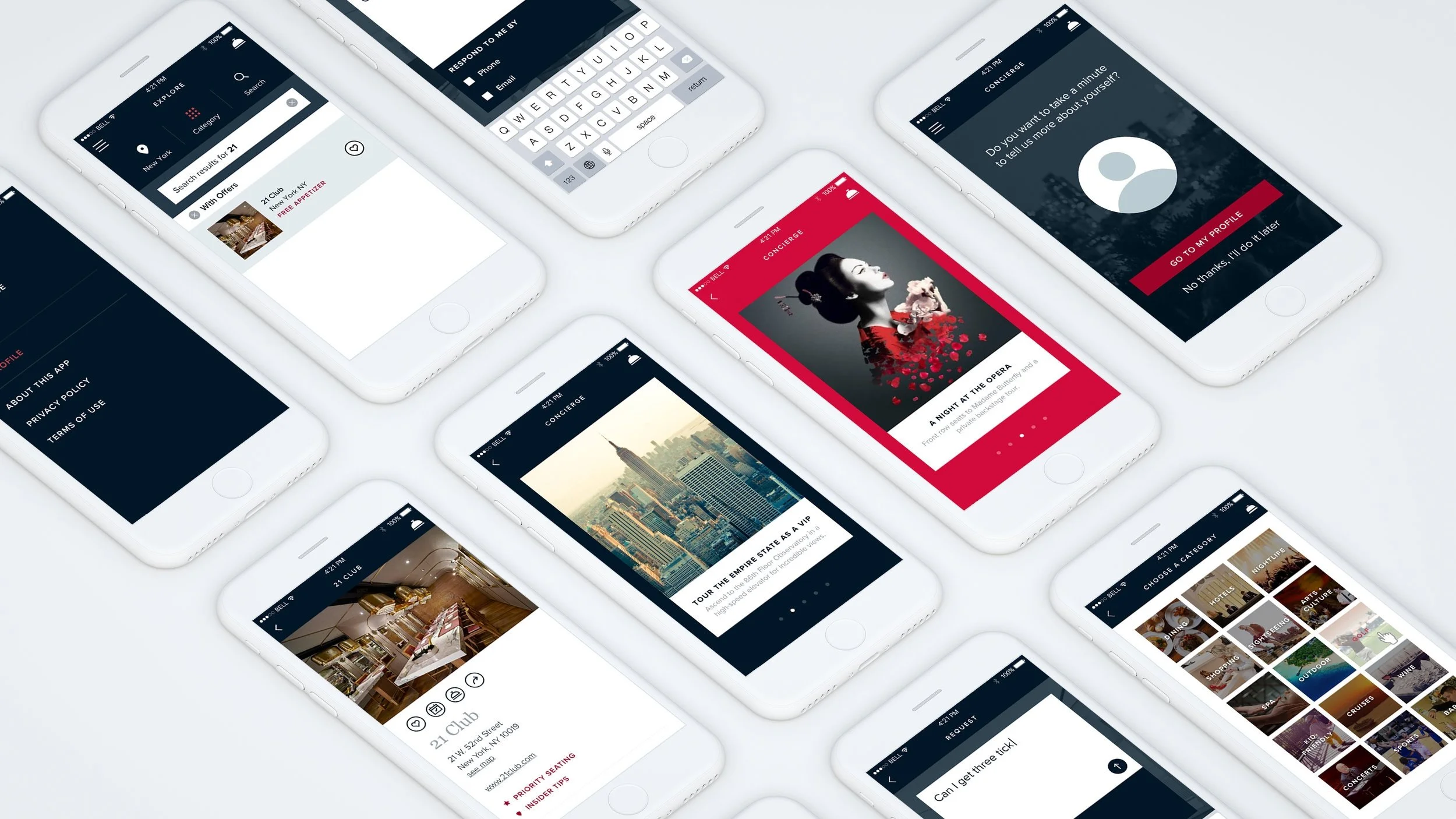
Mastercard had envisioned a rewards concierge mobile application that would guide customers, learn their preferences and suggest experiences similar to how a human concierge would help a guest in a hotel.
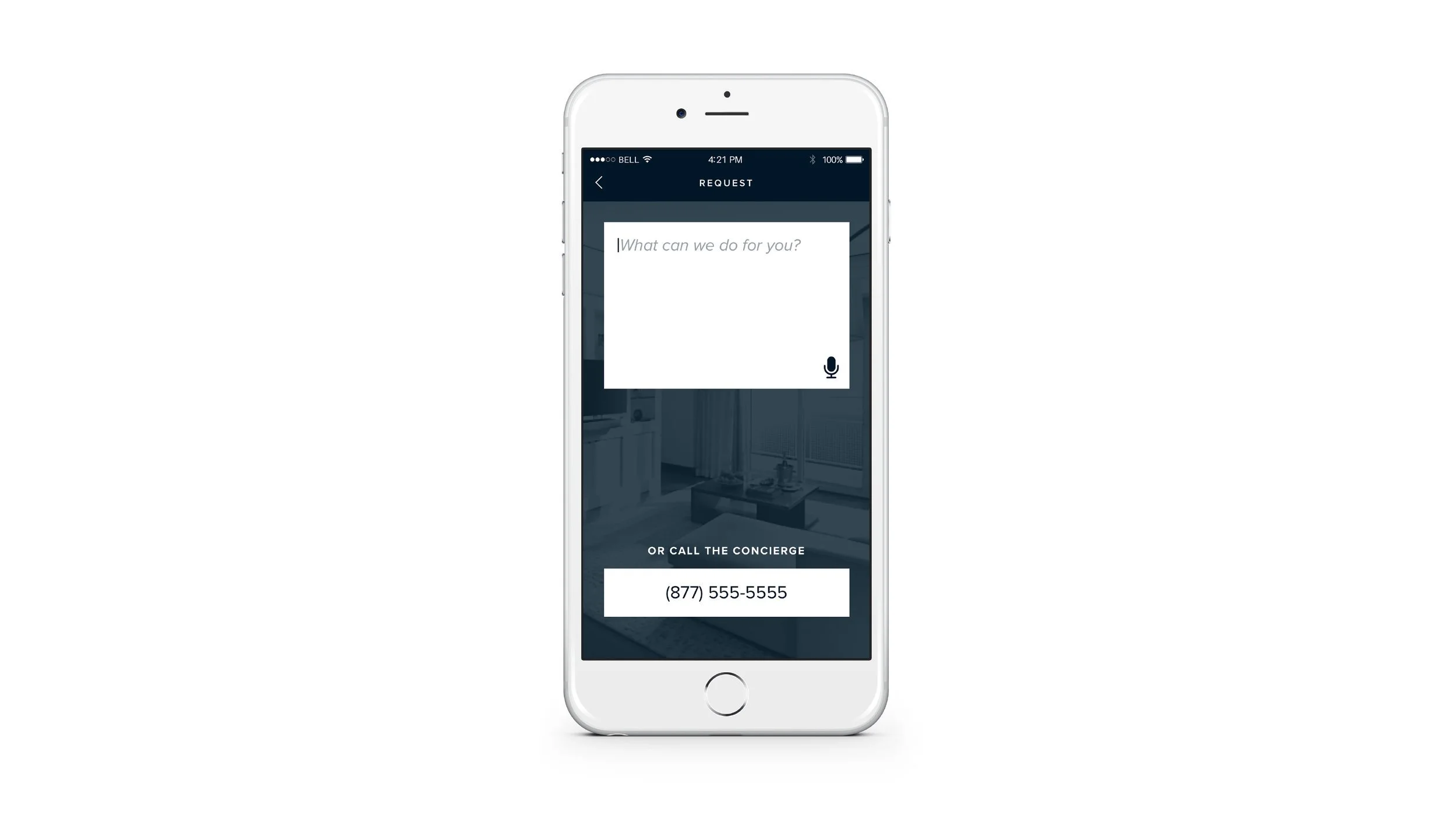
With key screens and architecture in place, the project needed detailed visual design, icons and further UX thinking across its flows.
Senior Visual Designer · Visual design, icons and flows
Visual Design
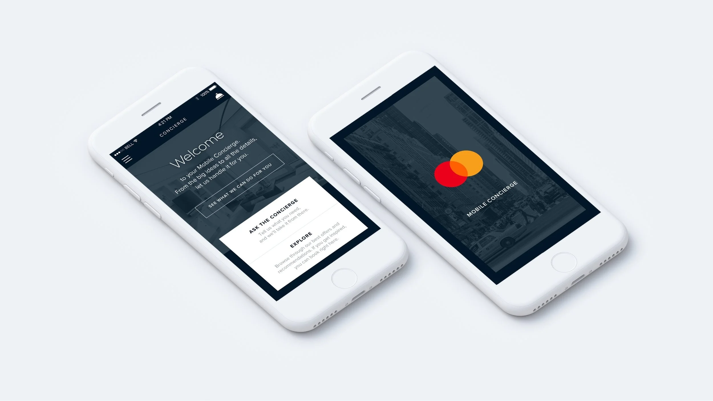
The app opens on two paths: ask the concierge, or explore offers and recommendations. Deep navy, white type and city photography give it the calm of a hotel front desk.
Flows
- Menu
- Back arrow
- Forward arrow
- Location
- Concierge
- Microphone
- Category
- Search
- Like
- Calendar
- Share
- Concierge outline
- Price tag
- Delete
- Recurring
- Priority seating
- Insider tips
Icons
Outcome
The concierge app launched to Mastercard cardholders.