Kindred at Home:


Challenge
When national in-home care provider Kindred at Home moved part of its services under a new brand, it needed a new corporate website to serve personal home care, palliative care and hospice.
Senior Designer · Brand experience, key screens and design library


Solution
Building on research from a recent Kindred at Home redesign, the project combined strategy, information architecture, UX and preliminary branding from BCG Brighthouse to create a warm, supportive look and feel.
The guiding symbol of Cairn stones served as a uniting graphic element across the site. Carried over from the initial logo design, the round overlapping shapes extended into a container for photography, a graphic background element and an illustrative icon style for communication points.
I carried the look and feel over six key screens to ensure that the entire site would have a consistent, balanced visual treatment.
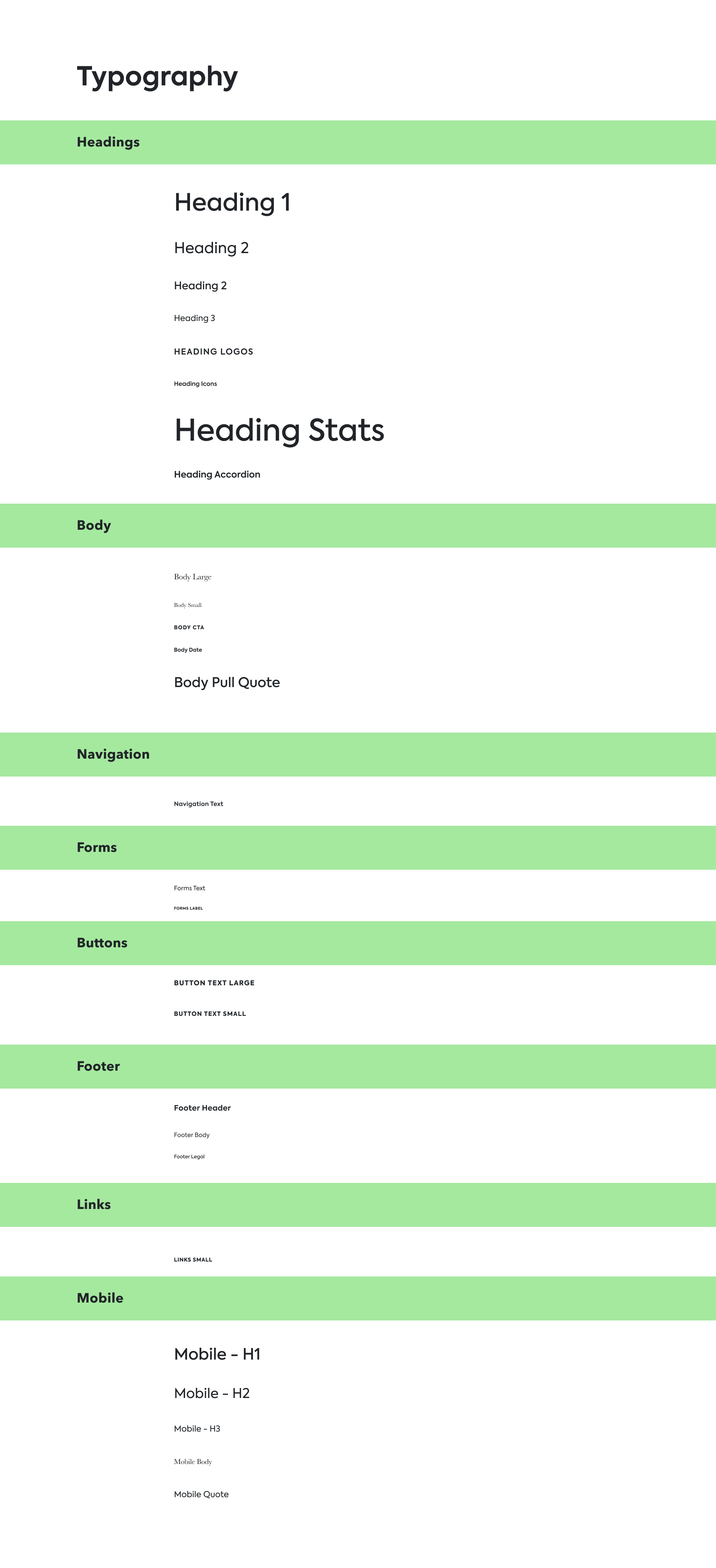
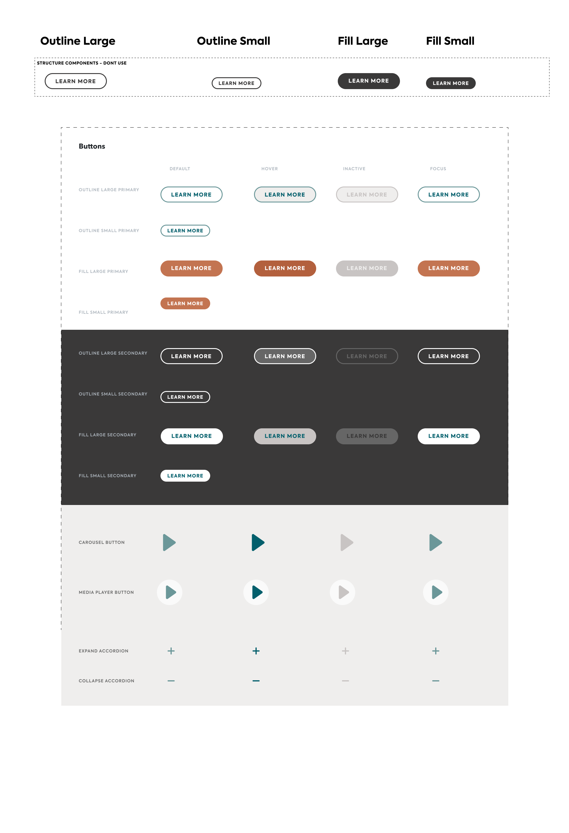
Alongside the key screens, I built a design library that gathered every style decision in one place for developers and future designers.
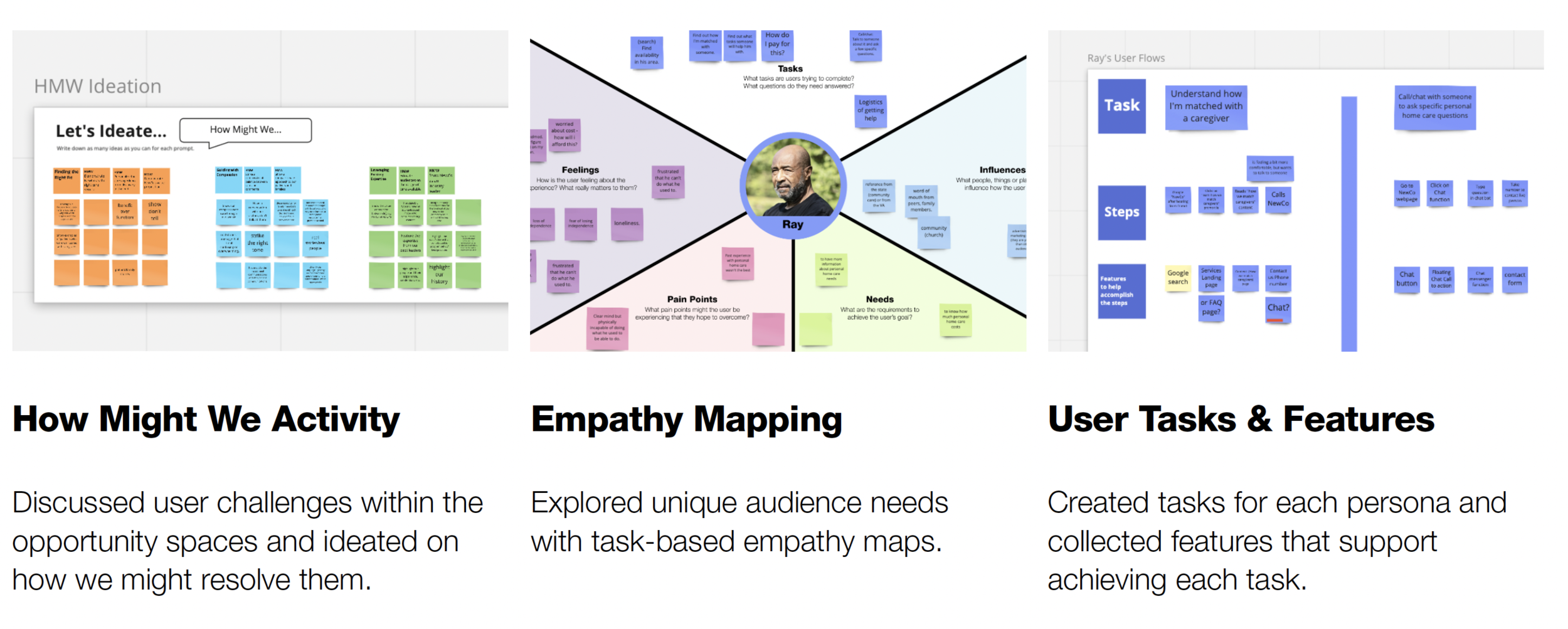
Research workshop activities
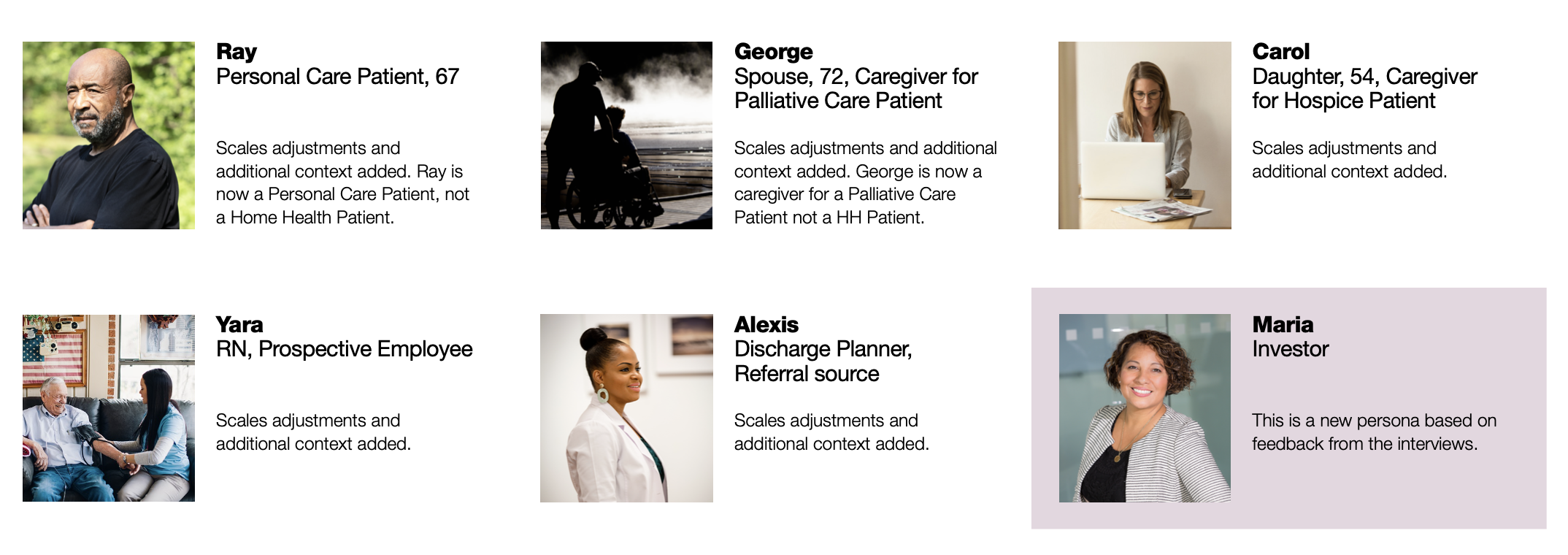
Personas
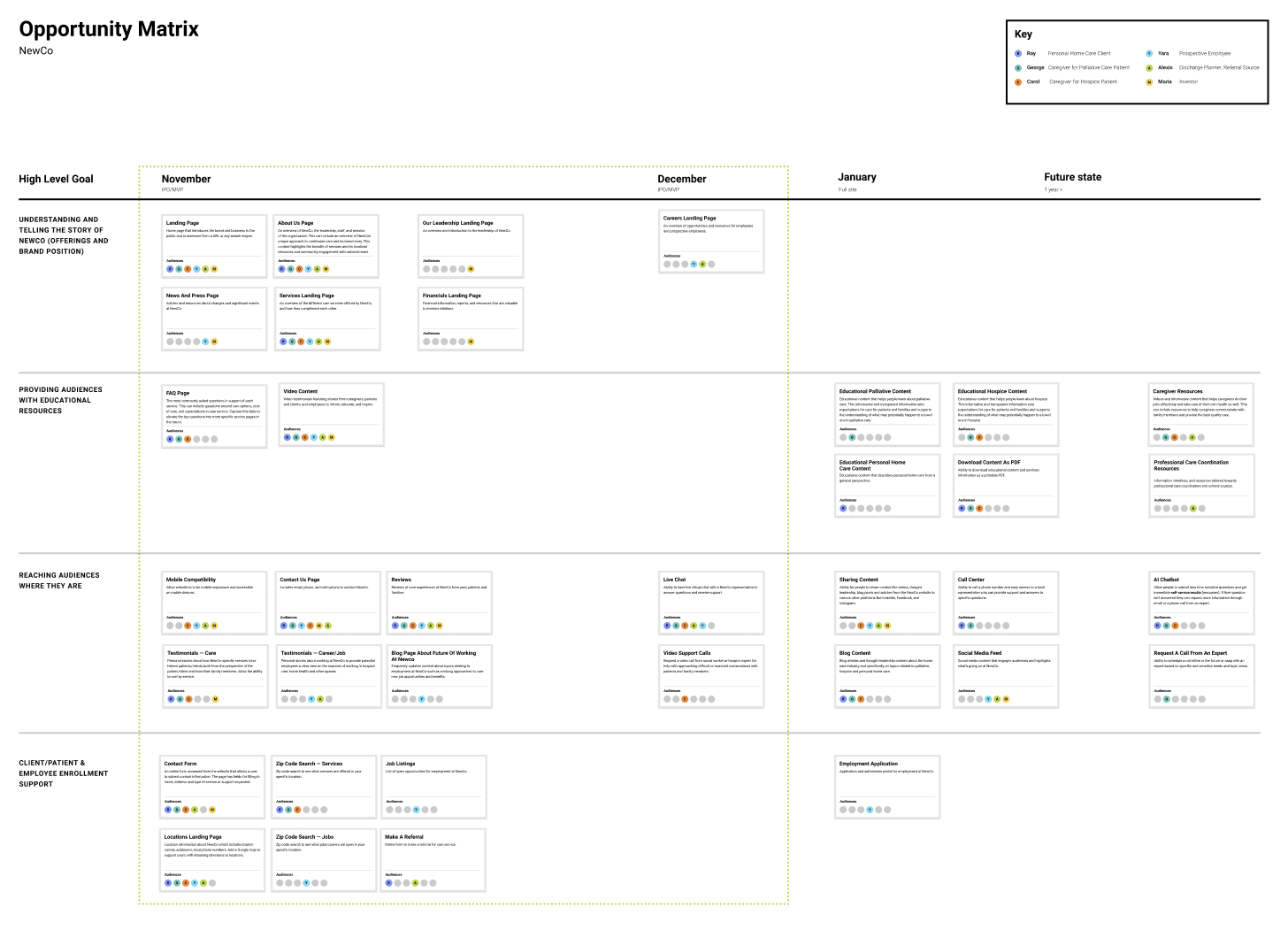
Opportunity matrix
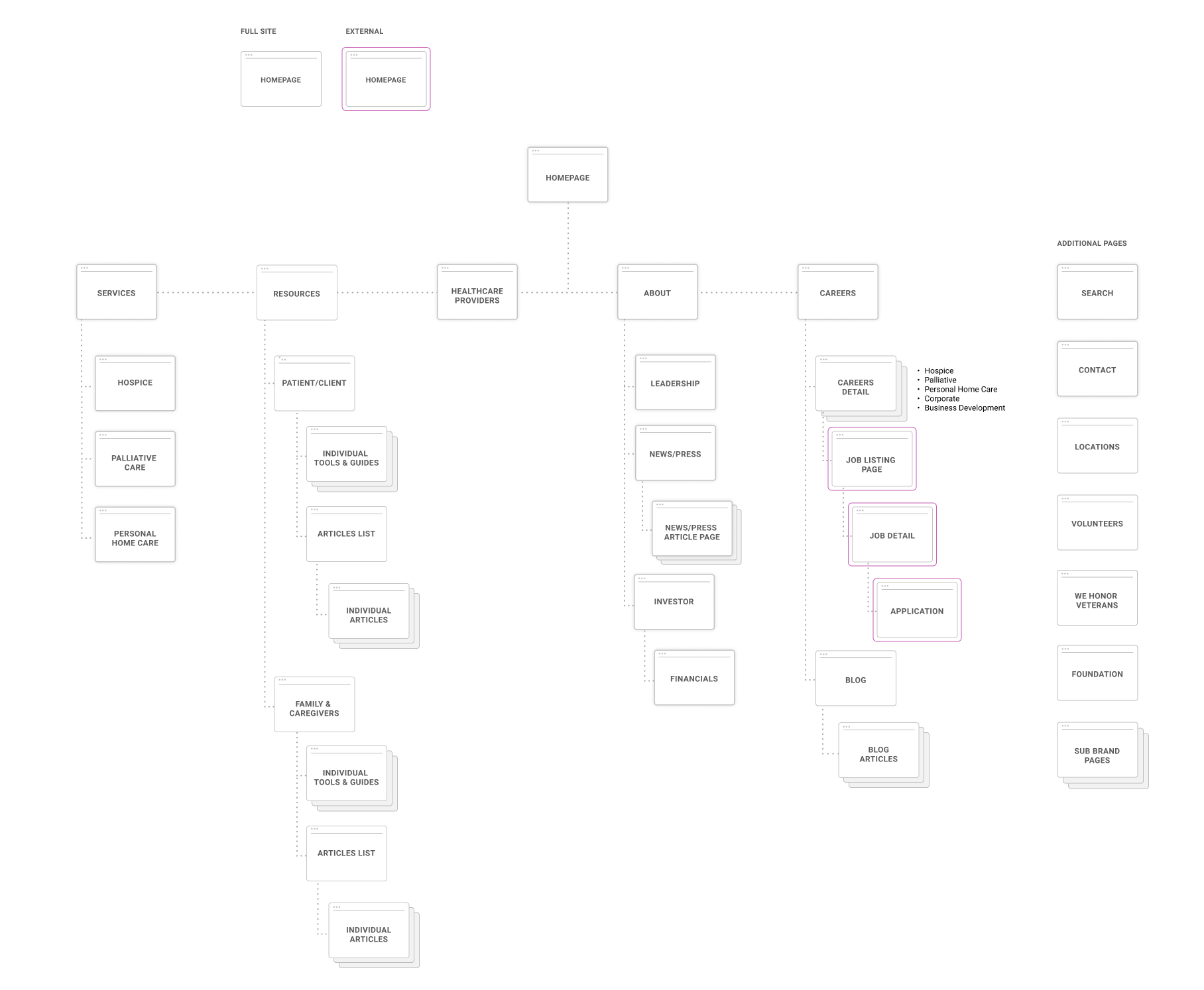
Site map
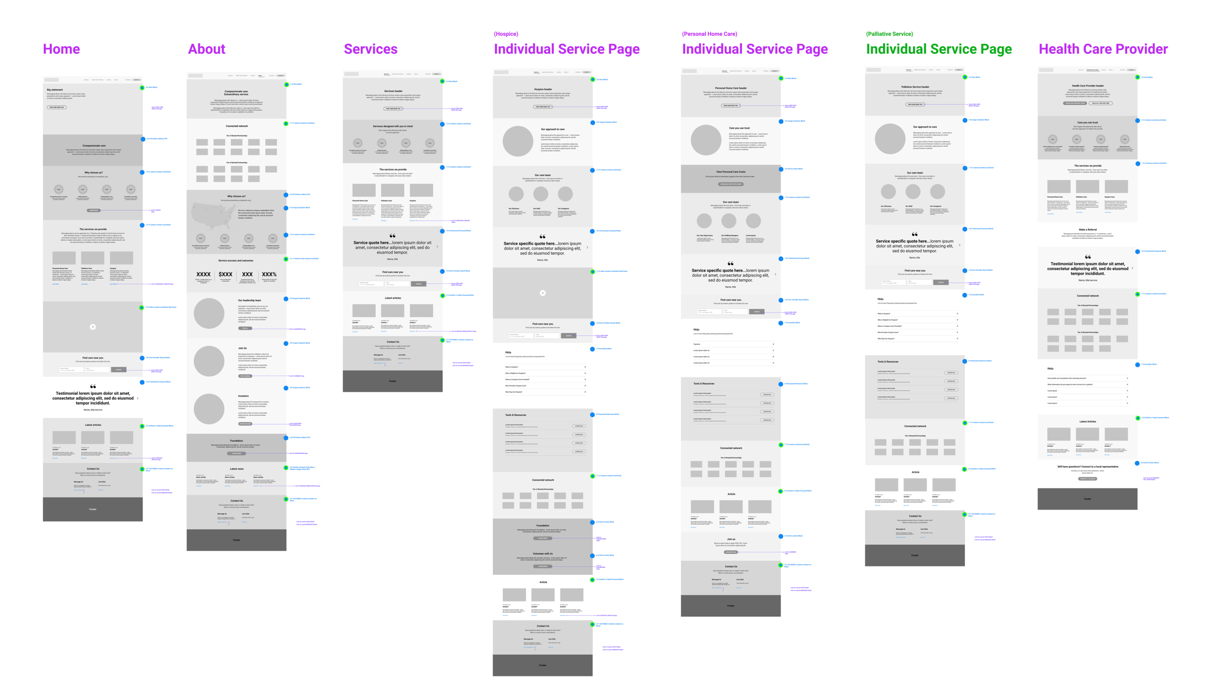
Wireframes
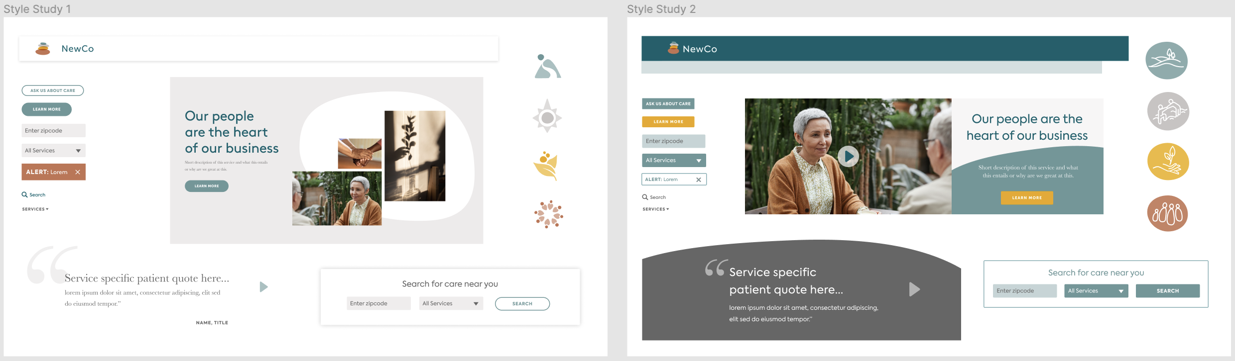
Visual style studies
Foundational work
As a multi-phase project that built upon previous work with the client, many areas of expertise came together to reach the final designs. My role as senior designer involved collaborating with the team to ensure cohesive thought and execution of several strategic deliverables.
The research built on findings from the rebranded Kindred at Home website to optimize for the new audience, validate personas and fill gaps in our understanding.
The research phase set the stage for an opportunity matrix, site map, wireframes, visual style studies and finally the brand experience implementation featured in the key screens above.
Outcome
The vision was delivered to Kindred at Home as six key screens and a design library for the new hospice brand.